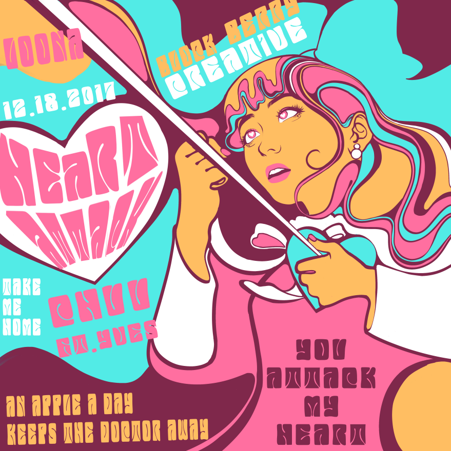
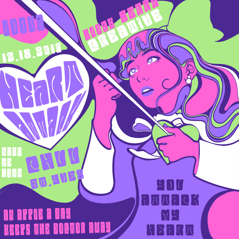
Album Cover | LOONA X Op-Art
DIGM2353: Page Layout and Design
Challenged with creating a vinyl record album cover based on a typographical movement, I mixed Optical Art inspired by Wes Wilson’s iconic psychedelic posters with Heart Attack, an upbeat song by Chuu who is a former member of the South Korean girl group LOONA.
I illustrated the portrait of Chuu in Adobe Photoshop, using a hard round brush for solid colors and a screentone brush for shading elements on the pink/skin.
The text on the cover was manipulated in Adobe Illustrator, warping a psychedelic font created by MysteryLab.
The final piece was compiled together in Adobe InDesign.
Draft 1

In my original drafts, I used a pink, orange, and blue palette that was loosely based on the lesbian pride flag, given the song’s sapphic indications in the lyrics and imagery in the music video of Heart Attack.
Draft 2

I later resolved to a pink, purple, and green palette to be more vivid and project a more out-of-body experience. The back side also took a drastic change to provide more information about the album and be more legible, rather than relying on graphical elements.
VDP Direct Mail | Digifest Invitations
DIGM3351: Individual Communication Processes


Utilizing XMPie’s uCreate Print extensions for Variable Data Printing (VDP) in Adobe InDesign, I created a personalized Digifest promotional postcard to be delivered through USPS Direct Mail with my team (Natalie Rees, Stephanie Le, and myself).
Personalized Digifest invitations feature a QR code redirecting recipients to an RSVP form with more information. Customized graphics and text elements catered to the recipient’s industry (motion media, graphic design, game development, AR/VR simulation development, and marketing) allow the postcard to cater to their interests better.
I collected nearly 100 entries within an Excel Spreadsheet for potential Digifest Invitation recipients in the local Sugar Land and Houston area. My team worked together to create a personalized invitation using VDP variations pulled from the spreadsheet in the form of:
Recipient’s first and last name
Recipient’s address
USPS mailing barcode
Company/Employer name
Industry-specific graphics
The imagery of a person interacting with an object related to the recipient’s industry
Circle graphic with industry interest fields that the University of Houston offers as a course for students
Industry-specific text line
Job title
Our team went through many iterations with critiques and feedback from the course students and instructor - transforming our drafts to a more minimalistic, simple approach that does not distract the viewer from the important information within the postcard.
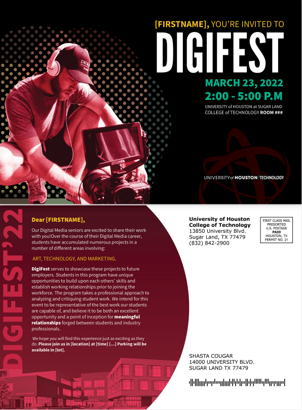
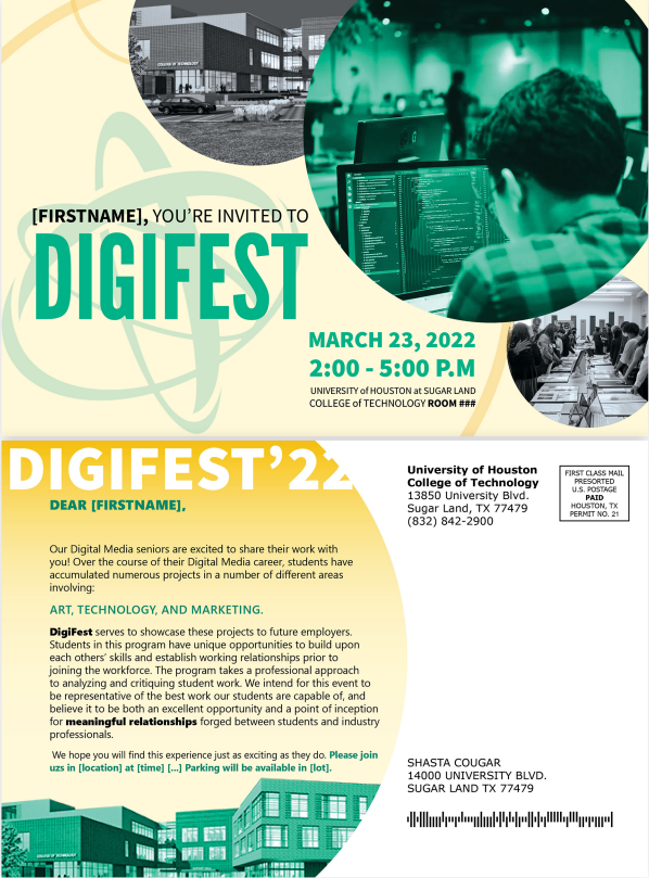
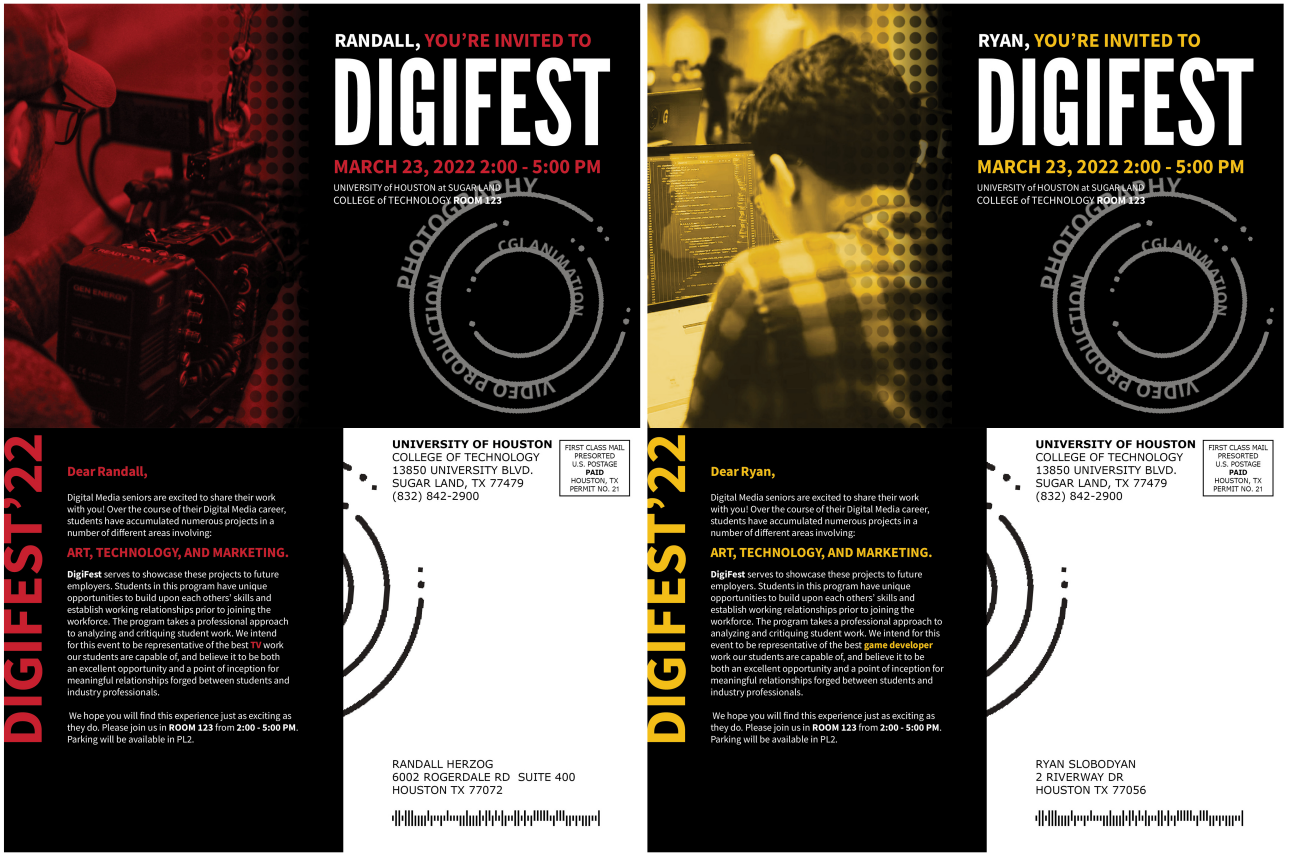
Although, I was sad that we ultimately reduced all color variations, such as yellow and green from the University of Houston’s branding guidelines, as it played no “deciding factor” in the recipient’s decision to RSVP and ultimately attend the Digifest event.
VDP Direct Mail | Bakery Coupons
DIGM3351: Individual Communication Processes


Utilizing XMPie’s uCreate Print extensions for Variable Data Printing (VDP) in Adobe InDesign, I created personalized Bakery Coupons postcards to be delivered through USPS Direct Mail.
Personalized bakery coupons feature a QR code for FirstL’s Bakery mobile business card, toggled discounts of percentages based on the recipient’s amount of orders, color changes depending on the recipient's gender, and graphical and textual differences based on the recipient’s preferred food item. Personalized imagery was used to cater to the user’s previous purchase history.
With a course-provided Excel spreadsheet listing over 100 user demographics and purchase history, I was able to implement better personalization of the coupon postcard to the recipient.
The VDP variations pulled from the spreadsheet in the form of:
Recipient’s first and last name
Recipient’s address
USPS mailing barcode
Purchase History-specific text and graphics
Imagery that caters to the user’s most frequently purchased food item: cakes, cookies, doughnuts, or muffins
“Free [food item]” on the front side’s hook and back side’s subtitle
Discount percentage based on the number of user purchases ranging from 0% - 25%, in multiples of 5’s
Gender-specific color palette
Event Deliverables | Digifest
DIGM2353: Page Layout and Design
This project is targeted at creating promotional pieces (poster, bifold, ID Card) for the annual UH College of Engineering’s* career fair designated for senior Digital Media students.


The original thumbnails played heavily on the University of Houston branding guidelines’ color palette and the concept of “bridging the gap” between art and technology. As Digifest showcases the Digital Media program’s senior students I wanted to emphasize a variety of different aspects of how these two fields directly interact with each other.
Ultimately, I went more along the lines of Draft One, while adding icons of artistic and technological motifs behind the students who are the “bridge” between the two worlds and are the “golden” examples of what the University of Houston students should be.
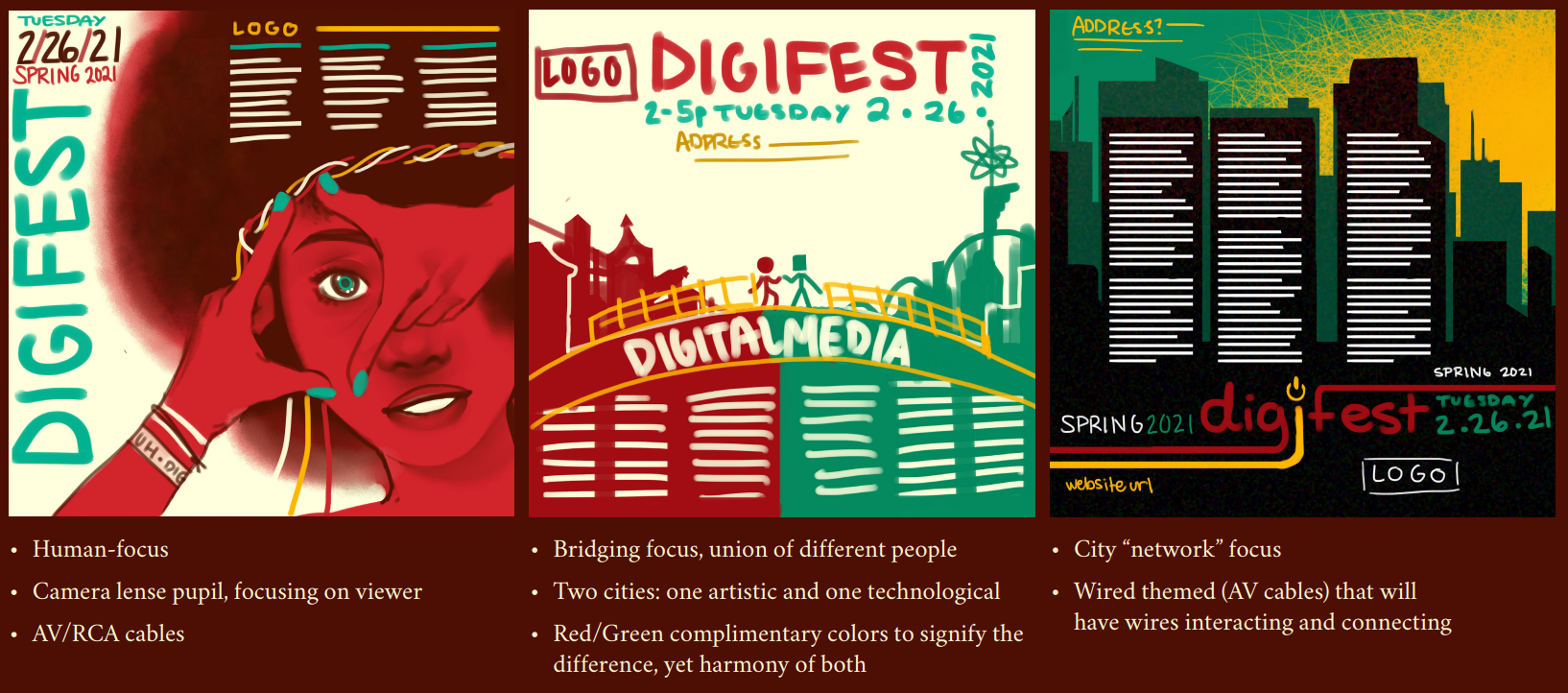

*Formerly the College of Technology, until the merger in the spring of 2023.